6th Grade Art
Dear Students and Parents,
This year in 6th
grade, every student takes art class. I
am very excited and honored to have the opportunity to lead students though the
6th grade art curriculum. I
have a few things I would like to share with you about what our year in art
will look like.
1.
Goals: (A
few of my goals for the year).
a.
Create a fun and
positive learning environment for each student.
b.
Challenge each
student to think, problem-solve, be creative, and grow.
c.
Share my love and
passion for art (hopefully it becomes contagious).
d.
Enhance each
student’s artistic vocabulary/understanding of the art elements and principles.
2.
Expectations for behavior: (A few things I appreciate from students in the art
room).
a.
Come to art class
prepared with a pencil each session.
b.
Come with a
positive attitude and willingness to work.
Keep comments positive!
c.
Come ready to
give your best and use work time to its fullest! Stay on task! Don’t give up!
d.
Respect each
other and the classroom/materials. BE A
GOOD LISTENER!
e.
Do you own work,
never draw on someone else’s art work.
3.
Pacing:
a.
Each class comes to
art once a week, which is 35 times this year at best. Once you factor in snow days, days off,
assemblies, band/choir concerts etc… we will have less than that.
b.
Please be
patient. Many of our projects take four
or more sessions to complete, so as we only meet once a week, that translates
to a month or longer for most of our projects.
c.
There may be long
stretches of time where student artwork will be at school. All artwork will be sent home by the end of
the year.
d.
Overall, we move
slowly but produce high quality work!
4.
Discipline:
a.
The art room
should be a safe, quiet environment where students feel free to focus, be
creative, and explore/experiment with the learning objectives.
b.
We will build a
social contract early in the year which we will need to abide by.
c.
I want the best
for each student, I want each student to have fun and enjoy art time, but there
are circumstances that require a discipline framework.
d.
I like to use the
old baseball “Three Strikes & You’re Out” for regular minor offenses
(talking too much, wasting work time, distractions, etc…)
i.
Strike 1 =
“four questions” and a verbal reminder.
ii.
Strike 2 =
“four questions”, verbal warning, and possible demerit or lunch detention.
iii.
Strike 3 =
Behavior discussion, “four questions”, lunch or after school detention, parent
phone call, possible trip to the office.
e.
Three demerits in
a semester will equal a detention.
f.
Three times being
tardy to class in a semester will equal a detention.
5.
Homework: There
is usually no homework unless a student is absent for an art class.
6.
Make-up Work: (If you are a slow artist or miss an art class, there are many ways to
catch up).
a. All assignments in each marking period must be
completed before grades are due, that is usually one week before the end of the
marking period.
i.
Connect
time is a great way to get caught up if you are behind.
Just get a
pass from Mr. VandenBerg to come in during connect on:
1. Wednesdays
2. Fridays
7.
Grades:
(I use the traditional 4.0 letter grade system).
a.
I grade based on
two things: The artwork and participation/effort.
b.
Participation/Attitude/Effort: Each time a student is in class, they earn or lose up
to five points. At the end of each
recording period, points are tallied and count as a participation/effort grade.
c.
Artwork: I grade the artwork based on several factors:
i.
The main learning
objectives of the project (50%)
ii.
Craftsmanship,
this is how neat and orderly the artwork is (25%)
iii.
Creativity and
originality (25%)
8.
Project Unit Outlook: (A quick look at our units).
·
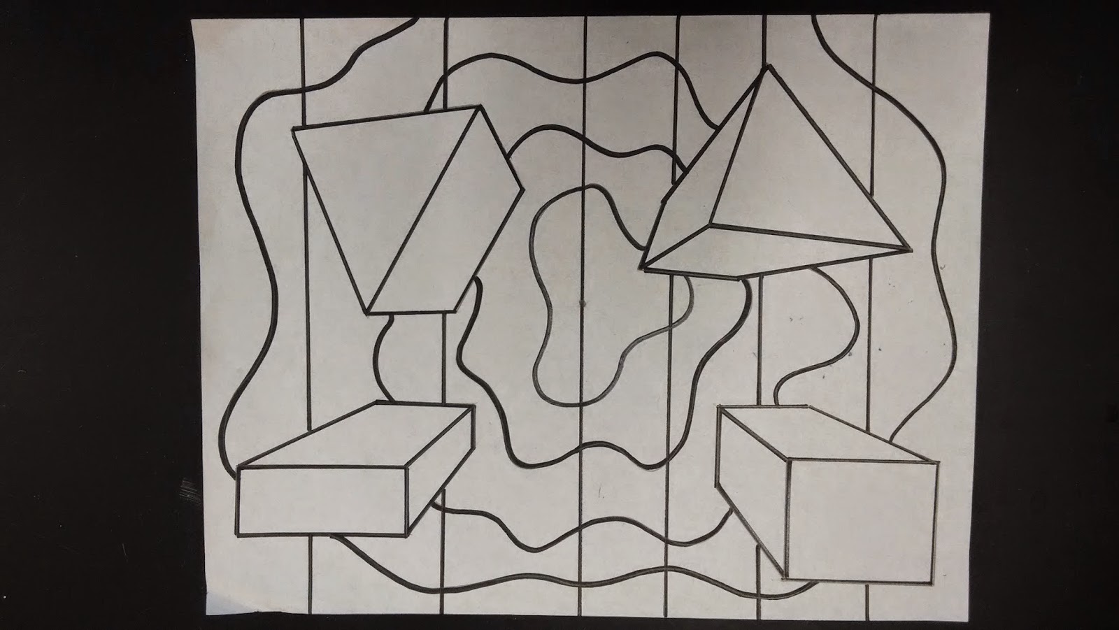
Drawing: One
point perspective drawing
·
Painting: Radial
design color wheel
·
Painting:
Emotional analogous color scheme painting
·
Pottery: Native
American Indian inspired pinch pots
·
Printmaking:
Designing a cover for an autobiography
·
Cubism: Art
history and an abstract self-portrait
·
Drawing: Realistic
observational drawing
·
Drawing: scratchboard
Thank you for taking the time to get to
know the 6th grade art program a little better. I look forward to having a great year with
the 6th grade students. If
you have any questions please feel free to contact me at nvandenberg@rockfordschools.org or 616-863-6140 ex. 1234.
Sincerely,
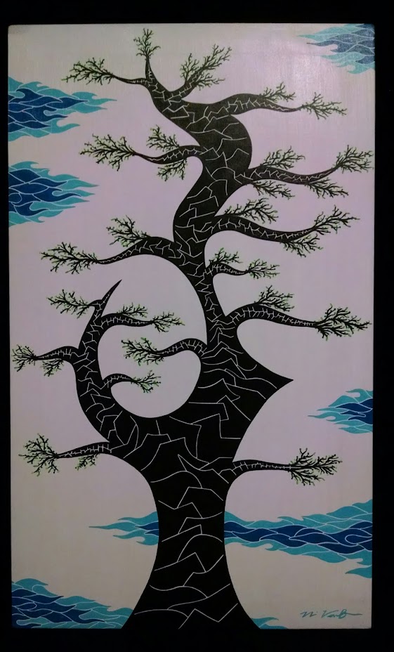
Mr. VandenBerg
6th Grade Art Teacher
East Rockford Middle School